| 04-20-14, 09:24 AM | #1 | |
|
A Cobalt Mageweaver
Join Date: Sep 2008
Posts: 210
|
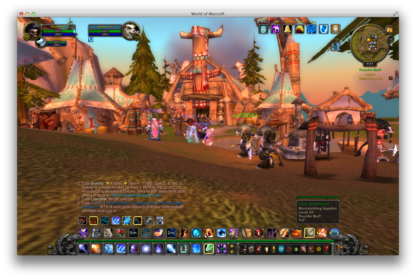
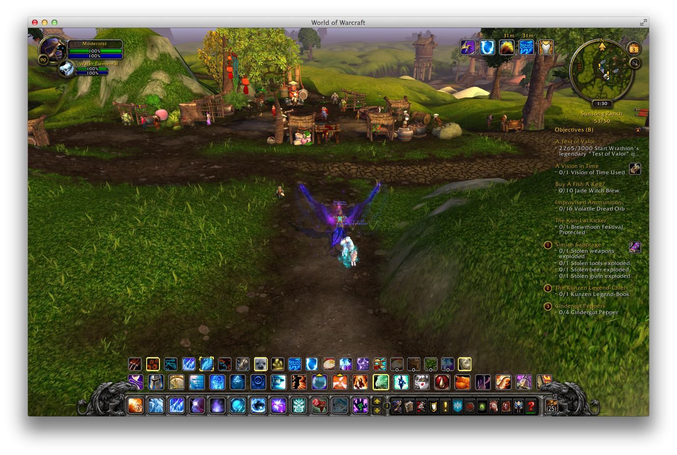
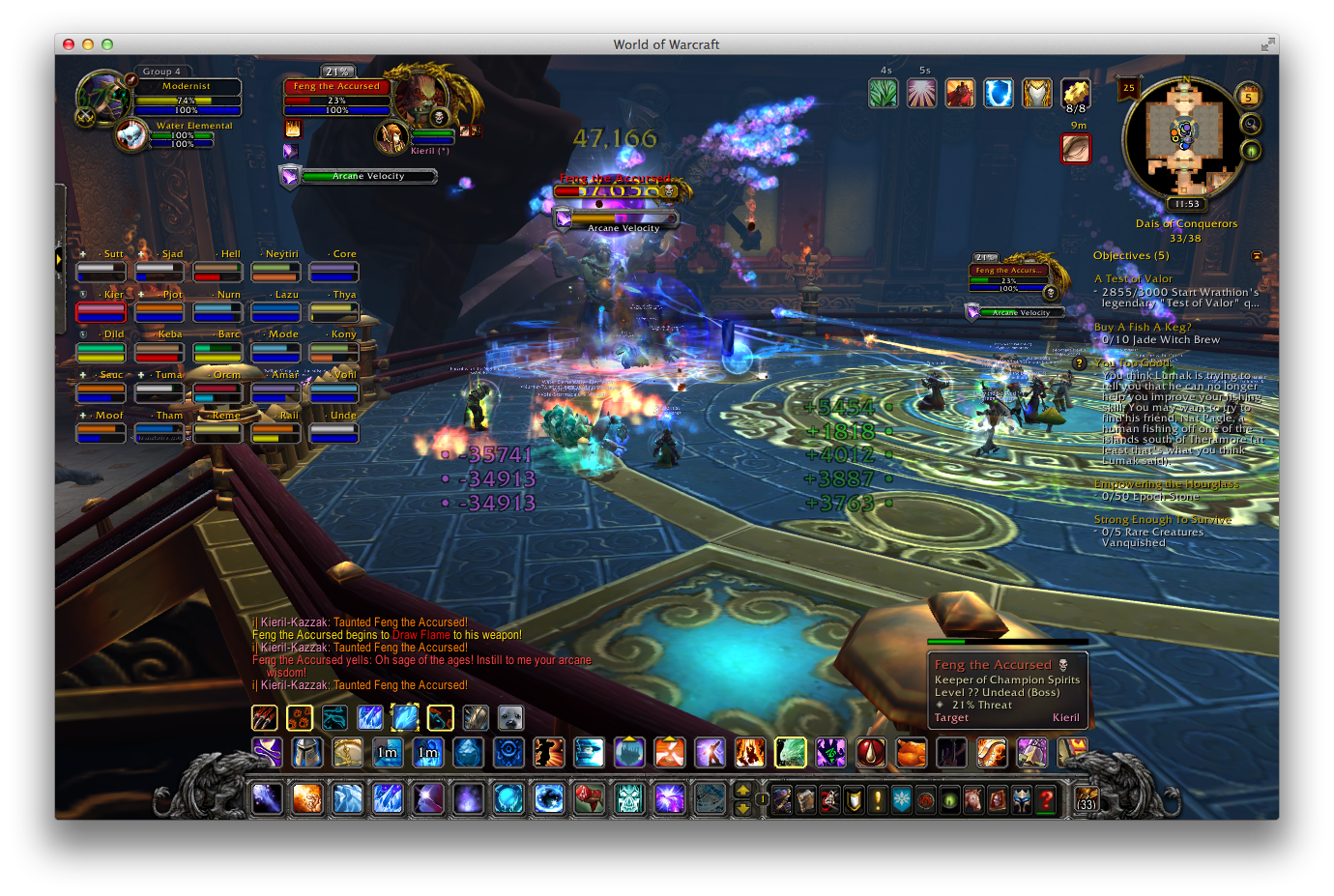
Making the default UI cleaner
Last edited by ObbleYeah : 05-02-14 at 11:37 AM. |
|

|

| 04-20-14, 04:00 PM | #2 | |
|
A Frostmaul Preserver
Join Date: Aug 2006
Posts: 267
|
||
|
|
| 04-20-14, 04:25 PM | #3 | |
|
Fishing Trainer

Join Date: Oct 2006
Posts: 10,860
|
__________________
"You'd be surprised how many people violate this simple principle every day of their lives and try to fit square pegs into round holes, ignoring the clear reality that Things Are As They Are." -Benjamin Hoff, The Tao of Pooh  |
|
|
|
| 04-20-14, 04:34 PM | #4 | |
|
A Cobalt Mageweaver
Join Date: Sep 2008
Posts: 210
|
Last edited by ObbleYeah : 04-20-14 at 04:46 PM. |
|
|
|
| 04-21-14, 03:15 PM | #5 | |
|
A Cobalt Mageweaver
Join Date: Sep 2008
Posts: 210
|
||
|
|

| 04-21-14, 07:08 PM | #6 | |
|
Cat.

Join Date: Mar 2006
Posts: 5,617
|
__________________
Retired author of too many addons. Message me if you're interested in taking over one of my addons. Dont message me about addon bugs or programming questions. |
|
|
|
| 04-22-14, 04:06 AM | #7 | |
|
A Cobalt Mageweaver
Join Date: Sep 2008
Posts: 210
|
||
|
|
| 05-02-14, 11:35 AM | #8 | |
|
A Cobalt Mageweaver
Join Date: Sep 2008
Posts: 210
|
Last edited by ObbleYeah : 05-02-14 at 02:44 PM. |
|
|
|
| 05-02-14, 04:21 PM | #9 | |
|
A Frostmaul Preserver
Join Date: Aug 2006
Posts: 267
|
||
|
|
| 05-03-14, 04:51 AM | #10 | |
|
Proceritate Corporis
Join Date: Feb 2006
Posts: 1,176
|
||
|
|

| 05-03-14, 06:41 AM | #11 | |
|
A Cobalt Mageweaver
Join Date: Sep 2008
Posts: 210
|
||
|
|
| 05-03-14, 06:05 PM | #12 | |
|
Cat.
Join Date: Mar 2006
Posts: 5,617
|
__________________
Retired author of too many addons. Message me if you're interested in taking over one of my addons. Dont message me about addon bugs or programming questions. |
|
|
|
| 05-05-14, 05:19 AM | #13 | |
|
A Cobalt Mageweaver
Join Date: Sep 2008
Posts: 210
|
||
|
|
| 05-05-14, 10:56 PM | #14 | |
|
Cat.
Join Date: Mar 2006
Posts: 5,617
|
__________________
Retired author of too many addons. Message me if you're interested in taking over one of my addons. Dont message me about addon bugs or programming questions. |
|
|
|
| 05-06-14, 12:31 AM | #15 | |
|
A Pyroguard Emberseer

Join Date: Sep 2007
Posts: 1,060
|
||
|
|
| 05-06-14, 01:37 AM | #16 | |
|
A Molten Giant

Join Date: Feb 2011
Posts: 583
|
||
|
|
| 05-06-14, 03:10 AM | #17 | |
|
A Cobalt Mageweaver
Join Date: Sep 2008
Posts: 210
|
Last edited by ObbleYeah : 05-06-14 at 03:13 AM. |
|
|
|
| 05-06-14, 03:20 AM | #18 | |
|
A Molten Giant
Join Date: Feb 2011
Posts: 583
|
||
|
|
| 05-06-14, 07:52 AM | #19 | |
|
A Cobalt Mageweaver
Join Date: Sep 2008
Posts: 210
|
||
|
|
| 05-06-14, 10:09 AM | #20 | |
|
A Cobalt Mageweaver
Join Date: Sep 2008
Posts: 210
|
||
|
|

 Linear Mode


WoWInterface
AddOn Sites
© 2004 - 2022 MMOUI
vBulletin © 2024, Jelsoft Enterprises Ltd