| Go to Page... |
Pictures
File Info

| Compatibility: | Warlords of Draenor (6.0.3) |
| Updated: | 12-08-14 09:05 AM |
| Created: | 07-22-11 06:36 AM |
| Downloads: | 13,530 |
| Favorites: | 33 |
| MD5: | |
| Categories: | Generic Compilations, Graphical Compilations, Minimalistic Compilations, Class Compilations, DPS Compilations |
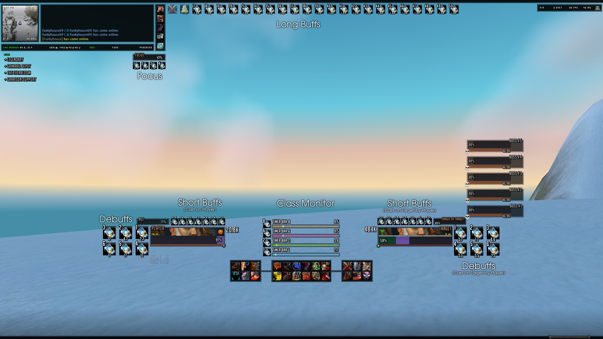
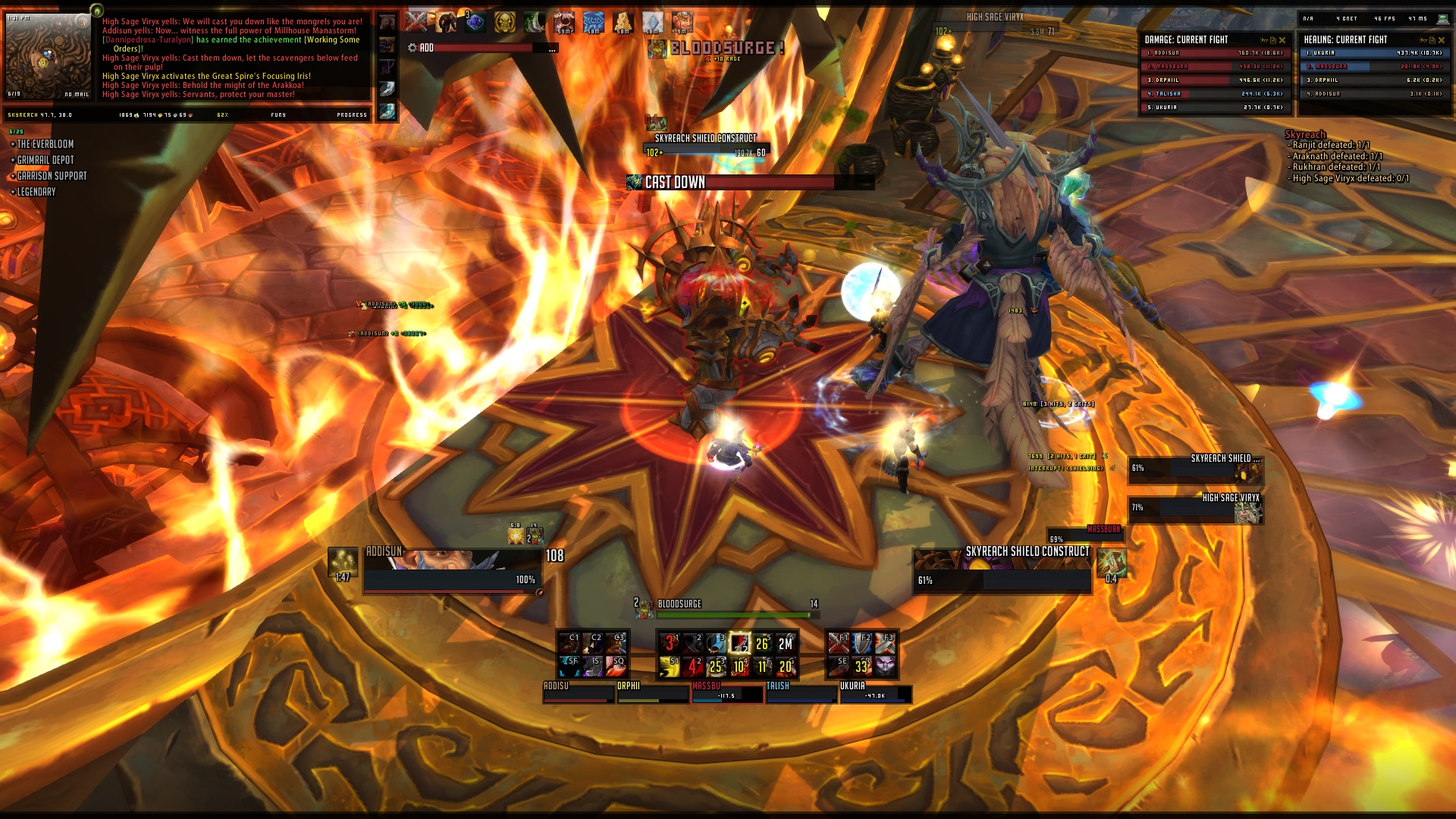
Fundamental UI 


What Is Fundamental UI?
Fundamental UI is based off one simple idea, one of which I am sure many UI builders and designers
always take into consideration, that is to include as much useful information in as little screen space as
possible, it is in essence what minimalism is meant to be and as Da Vinci would put it, the height of
sophistication. However over the years, one UI style has dominated the forefront when it came to
this idea. One we are all very aware of, chat log left, chat log right, action bars middle, minimap top right/left,
Done and dusted, and I can't comment as I also was part of that group that contributed to that UI style taking
center stage.
Fundamental WoD is an attempt to break away from that niche, taking two concept UIs I have worked on
previously and fusing them together to create this rather unique (in comparison to most current UIs) style
of interface whilst still Including well known features which I believe help contribute to effective and
efficient gameplay in any WoW gaming environment.
Installation Guide
OUT OF GAME
1. Download and extract Interface and WTF to desktop.
2. Go to your World of Warcraft directory and remove andback up your old
WTF/Interface Folders.
3. Place the new downloaded Fundamental folders into your WoW Directory.
4. Go into WTF and then into Account and rename "ACCOUNT" to your account name.
5. Go into the newly renamed "ACCOUNT" and Change "Server Name" to your server name.
6. Go into "Server Name" and change "Character Name" to your character's name.
7. Load the game and watch the pretty WoD Cinematic, load out of date addons (not that there
is any!).
8. Login to the character you wish to configure.
IN GAME
1. Type /BT4 go to profiles and copy from profile Addisun
2. Type /Grid2 go to profiles and copy from profile Addisun
3. Type /Raven go to profiles and copy from profile Addisun
4. Whilst In Raven go to Bar groups, select Class Track from the drop down top left,
select buffs along the top tab group below, scroll down to Filter List and add your
own class buffs you wish to track (should already be setup for Prot/Fury Warriors)
5. Type /KuiNamePlates go to profiles and copy from profile Addisun
6. Unlock your chat window and move to the correct area (takes some fiddling)
7. Type /reload
8. Configure your graphics settings again, it should maintain 1920x1080 but all others should
reset to default, same goes for sound.
9. If you're really fussy drag the little AtlasLoot icon around until it's in the top right
corner of the minimap.
Known Bugs/Compatability
1. Breeze is still very much in Beta and can bug out occasionally on certain follower quests
2. Fambags can be a little iffy with its categories from time to time, a simple /reloadui should do the
trick.
Enjoy
Shiny <3
[email protected]
Addon List
Bugs - !BugGrabber >link<,
Mobs - NPCScan >link<,
Minimap - NPCScanOverlay >link<,
UI Design Aid - Align >link<,
Combat Assist - Announce Interrupts >link<,
Item Finder - AtlasLoot >link<,
UI Art & Skin - Aurora >link<,
Inventory - AutoRepair >link<,
Action Bars - Bartender4 >link<,
Boss Mods - BigWigs >link<,
Data Broker - Broker_Currency >link<,
Data Broker - Broker_MicroMenu >link<,
Data Broker - Broker_uClock >link<,
Data Broker - Broker_wFPS >link<,
Data Broker -Broker_wLatency >link<,
Bugs - Bugsack >link<,
Inventory Mass Buy - BuyEmAll >link<,
Raid Assist - CameraMaxFactor >link<,
Chat Log - Chatter >link<,
Minimap - Chinchilla >link<,
Dispell Assist - Clique >link<,
UI Design Aid - ColorPickerPlus >link<,
Inventory Auto Sell - CrapAway >link<,
Targetting Sounds - DamnUnitSounds >link<,
UI Frame Mover - DragEmAll >link<,
Data Broker - DualSpeccer >link<,
Char Frame - EasyiLvl >link<,
Combat Spam - ErrorFilter >link<,
Inventory/Bags - FamBags >link<,
Char Frame - Fizzle >link<,
Cast Bars - Gnosis >link<,
Raid/Party Frames - Grid2 >link<,
Raid Assist - GTFO >link<,
Map - HandyNotes >link<,
Map - HandyNotesDraenorTreasures >link<,
Data Broker - iLocation(Broker) >link<,
Data Broker - iTracking(Broker) >link<,
Data Broker - iMail(Broker) >link<,
UI Art & Skin - KGPanels >link<,
Name Plates - KuiNamePlates >link<,
Dungeon Boss Mods - LittleWigs >link<,
Map - Mapster >link<,
Button Skinning - Masque >link<,
Button Skinning - MasqueLiteStep >link<,
Garrisons - Master Plan >link<,
Scrolling Combat Text - MikScrollingBattleText >link<,
Data Broker - MyDurability >link<,
Action Bar Cooldown Count - OmniCC >link<,
Middle Mouse Assist - OPie >link<,
Button Skinning - OPieMasque >link<,
Mail - Postal >link<,
Data Broker - Progress(Broker) >link<,
Buffs & Tracking - Raven >link<,
Unit Frames - Shadowed Unit Frames >link< ,
UI Art & Skin - SharedMedia >link<,
Tooltip - SimpleILevel >link<,
Alt Power Bar - SimplePowerBar >link<,
Damage Meters - Skada >link<,
Questing - SorhaQuestLog >link<,
Data Broker - StatBlock_Folks >link<,
Data Broker - StatBlockCore >link<,
Tooltip - TipTac >link<,
Looting - Xloot >link<
Garrison Notifications - XanAchievementMover - >link<
v1.0 RELEASE
- Final release of this style of UI (Addon package will be continually updated however further iterations will not occur)
- Major change over from old MoP Sharedmedia and organised naming system to newer WoD Sharedmedia
- Added XanAchievementMover to deal with Garrison Notifications
- Updated all addons
v0.4.1 BETA
- All addons updated and ready to go
- BigWigs/LittleWigs updated prior to raid release (also old cata/wrath/tbc modules updated)
- Breeze addon removed and replaced with Master Plan Garrison addon
- Aurora updated for better Garrison UI support
v0.4 BETA
- Fixed pixel borders around minimap and gnosis cast bar icon
- Swapped from Pitbull to Shadowed Unit Frames
- Added Dungeon/Raid Multi Boss Frames with Boss count buff/debuffs
- Added Support for Runes/Class Bars/Combo Points
- Removed Raven Cooldown Count Tracker (Cluttered screen, wasn't looking at it)
- Added Interrupt Announce addon
- Tidied up SorhaQuestLog addon (now hides in raids/bgs/arenas to provide more real estate)
- Added Pet Bar below player unitframe (right hand side)
- Adjusted Xloot slightly
- Removed VexPower (no longer needed with SUF)
- SorhaQuestLog now supports appexis crystal dailies & other progress bars
- All addons updated
v0.3.1 BETA
- Fixed Initial setup bug with test mode and unlocked alternative power bar
- Fixed Grid solo layout
v0.3 BETA
- Added new Micromenu Bar with brokers (Latency, FPS, Friends and a Skada Toggle)
- Added Grid2 Power Bars & Aggro Borders
- Added an Alternative Power Bar addon for quests and raid/dungeon instances below unitframes
- Adjusted the size of Bigwigs Bars & Player Range Debuff Indicator.
- Added Breeze addon to decrease animations during follower missions
- Updated SorhaQuestLog (now shows random mission objectives)
- Updated AtlasLoot (now shows other missing raid instances ToC for example)
- Updated all available addons
v0.2 BETA
- Official release of Fundamental UI for WoD
Optional Files (1)
File Name |
Version |
Size |
Author |
Date |
Type |
0.1 |
96kB |
12-09-14 10:33 AM |
Patch |
 |
Comment Options |
 12-09-14, 05:16 AM
|
|||
|
A Deviate Faerie Dragon
Forum posts: 14
File comments: 108
Uploads: 7
|
And cheers, it's requiring some severe tweaking at the moment, everything's a little too big for my liking, I tend to like my grid frames to be centre of the screen but that takes up too much real estate!
Cheers, I appreciate the compliment, and I love seeing screenshots if you've got time! ^^ I like seeing it in action! May I ask what you changed/added? It's always good to get user feedback then I can take it into account and adapt it to better suit next time around! And thanks (:
__________________

Last edited by Shiny <3 : 12-09-14 at 05:18 AM.
|
||

|

|
| Shiny <3 |
| View Public Profile |
| Send a private message to Shiny <3 |
| Visit Shiny <3's homepage! |
| Find More Posts by Shiny <3 |
| Add Shiny <3 to Your Buddy List |
|
12-09-14, 03:25 AM
|
|
|
A Kobold Labourer

Forum posts: 0
File comments: 13
Uploads: 0
|
Thought I saw someone else asking about this but could find the answer.
 So the Garrison bar is overlaping the bartender bar. I do not have that same problem on my main, where I first installed the UI on. It's just slightly overlaping but not like theres a problem. But for my alt there's another story, lol xD  Except from this I love your UI. Been using it for a couple of days and I cant wait untill you get the other UI layouts out here. All seems badass to me  
Last edited by Vinrus : 12-09-14 at 03:27 AM.
|
|
|
|
| Vinrus |
| View Public Profile |
| Send a private message to Vinrus |
| Visit Vinrus's homepage! |
| Find More Posts by Vinrus |
| Add Vinrus to Your Buddy List |
|
12-09-14, 02:22 AM
|
|
|
A Defias Bandit

Forum posts: 2
File comments: 42
Uploads: 0
|
I have now been using this UI for about 2weeks. And I gotta say. Really good job.
Thought at first it wouldnt fit my warlock at all, but after some easy changes (nothing major). It more badass than i could've imagine! You got yourself a new 'fan'. Cant wait for your new design.. |
|
|
|
| Telaq |
| View Public Profile |
| Send a private message to Telaq |
| Visit Telaq's homepage! |
| Find More Posts by Telaq |
| Add Telaq to Your Buddy List |
|
12-08-14, 03:23 PM
|
||
|
A Deviate Faerie Dragon
Forum posts: 14
File comments: 108
Uploads: 7
|
Re: The New Loadout?
__________________
|
|
|
|
|
| Shiny <3 |
| View Public Profile |
| Send a private message to Shiny <3 |
| Visit Shiny <3's homepage! |
| Find More Posts by Shiny <3 |
| Add Shiny <3 to Your Buddy List |
|
12-08-14, 02:24 PM
|
|
|
A Deviate Faerie Dragon
Forum posts: 10
File comments: 91
Uploads: 5
|
The New Loadout?
How does one get his hands on your new layout? ( I know you said it would be released after the patch on Saturday, I just didn't know when, unless it is actually in this pack already) I am really looking forward to it because you have some good work here
 |
|
|
|
| Bmw309894 |
| View Public Profile |
| Send a private message to Bmw309894 |
| Visit Bmw309894's homepage! |
| Find More Posts by Bmw309894 |
| Add Bmw309894 to Your Buddy List |
|
12-08-14, 12:51 PM
|
|||
|
A Deviate Faerie Dragon
Forum posts: 14
File comments: 108
Uploads: 7
|
Re: Re: <3
__________________
|
||
|
|
|
| Shiny <3 |
| View Public Profile |
| Send a private message to Shiny <3 |
| Visit Shiny <3's homepage! |
| Find More Posts by Shiny <3 |
| Add Shiny <3 to Your Buddy List |
|
12-08-14, 12:05 PM
|
||
|
A Kobold Labourer
Forum posts: 0
File comments: 276
Uploads: 0
|
Re: <3
I'm with you on this. I love the second layout. Map bugs me a little bit but nothing I couldnt deal with.
|
|
|
|
|
| Daigan |
| View Public Profile |
| Send a private message to Daigan |
| Visit Daigan's homepage! |
| Find More Posts by Daigan |
| Add Daigan to Your Buddy List |
|
12-08-14, 10:48 AM
|
|
|
A Kobold Labourer
Forum posts: 0
File comments: 1
Uploads: 0
|
<3
Hey Shiny <3,
i love your UI ! One of the greatest i ever had. I would like the second Ui of your 3 UIpictures, because all important frames are on the bottom..so you can see more from the world and i think its easyer in raids for voids etc. ^^ just my opinion sry for my bad english .. best regrets Syn666
Last edited by Syn666 : 12-08-14 at 10:49 AM.
|
|
|
|
| Syn666 |
| View Public Profile |
| Send a private message to Syn666 |
| Visit Syn666's homepage! |
| Find More Posts by Syn666 |
| Add Syn666 to Your Buddy List |
|
12-07-14, 11:48 AM
|
||
|
A Deviate Faerie Dragon
Forum posts: 14
File comments: 108
Uploads: 7
|
Re: ui
__________________
|
|
|
|
|
| Shiny <3 |
| View Public Profile |
| Send a private message to Shiny <3 |
| Visit Shiny <3's homepage! |
| Find More Posts by Shiny <3 |
| Add Shiny <3 to Your Buddy List |
|
12-07-14, 11:25 AM
|
|
|
A Deviate Faerie Dragon
Forum posts: 15
File comments: 314
Uploads: 0
|
ui
I think you will find the second one will impress most people but the original will impress some other's to a lesser degree eg myself can't get out of clicking and it's perfect for such.
Bottom line should be what you prefer and work on one ui as having 2 is a royal pain in the you know where. The reason you didn't get many comment's when you first posted the pic of the mid ui should tell you something though. 99 % of ui's are bottom based reason your's was becoming popular is that it was diff from them attracted a diff audience. Just my opinon. |
|
|
|
| meggalo |
| View Public Profile |
| Send a private message to meggalo |
| Visit meggalo's homepage! |
| Find More Posts by meggalo |
| Add meggalo to Your Buddy List |
|
12-07-14, 11:11 AM
|
||
|
A Deviate Faerie Dragon
Forum posts: 14
File comments: 108
Uploads: 7
|
Hopefully the boys at WoWinterface won't mind me running two UI packs at a time with the same addons essentially! ^^ I'll have some spare time over the next 2 days to finalise that bottom layout then I'll do the major overhaul update to come out some time Monday night or Tuesday morning (GMT). Sharedmedia has been dramatically overhauled for this next update (not running a MoP version anymore).
__________________
|
|
|
|
|
| Shiny <3 |
| View Public Profile |
| Send a private message to Shiny <3 |
| Visit Shiny <3's homepage! |
| Find More Posts by Shiny <3 |
| Add Shiny <3 to Your Buddy List |
|
12-07-14, 08:13 AM
|
|
|
A Kobold Labourer
Forum posts: 0
File comments: 15
Uploads: 0
|
Thank you for the fast feedback, found out some stuff, if u use elvui the garrison icon thingy is called bossbutton, but cant find anything in moveanything, the login user issue i had was easy, just installed an addon, so thats fixed, but the garrison complete is still there.
When it comes to ui, i would really like to try the middle one, where everything is on the bottom screen. -Trond |
|
|
|
| trondd |
| View Public Profile |
| Send a private message to trondd |
| Visit trondd's homepage! |
| Find More Posts by trondd |
| Add trondd to Your Buddy List |
|
12-07-14, 05:58 AM
|
|||
|
A Deviate Faerie Dragon
Forum posts: 14
File comments: 108
Uploads: 7
|
Concerning current iterations and versions of this UI I'm currently torn as to what to do in that regard. Essentially right now I have 3 UI setups, the available Fundamental download, the one pictured below and the one I'm currently using. All 3 setups use exactly the same addons but all 3 look and behave very differently to the others. The one below actually isn't finished yet, as I kind of bailed on it for being too big and I wasn't happy with it, I still have all of the saved variables and such for it but I've not been working on it for a while (although I'm certain it wouldn't take me too long to finish, although again I don't get paid for this so finding the time to do it certainly is troublesome). That being said, I'm debating maintaining either 3 separate downloads (one for each variant) or combining the 3 into one download package that you would then pick and chose as to which you wanted to use. As they're just lua text files altering positioning and such it wouldn't take any extra space up and the addons and layout would essentially stay the same. I'll upload the images below for the 3 variants, although I would very much like the communities opinion on this one! ^^    Obviously here we have the Original variant, what I call Trifex (3 Skada logs), and finally Pixel Perfect (the one I currently use). Both Trifex and Pixel expanded to use more action bars as that was a requested feature, and the button bloat cull wasn't that severe for all classes as it was others. But Trifex still felt too heavy for me as a UI, I adored its layout which was reminiscient of an older UI from the Wrath days I was a big fan of (on wowuigallery.com). But Pixel was just designed around raiding for me, specifically for me, I'm a big fan of condensing as much information down as possible in as little space as possible, and pixel fonts for me achieve that, I sit quite close to the screen and so I can always read them where necessary etc. I know all 3 of these comps won't be for everyone (a lot of people hate pixel fonts) but It needed to be made for me, so I made it. TL;DR? So to conclude, exact same compilation, different layouts/saved variables. Opinions?
__________________
Last edited by Shiny <3 : 12-07-14 at 06:09 AM.
|
||
|
|
|
| Shiny <3 |
| View Public Profile |
| Send a private message to Shiny <3 |
| Visit Shiny <3's homepage! |
| Find More Posts by Shiny <3 |
| Add Shiny <3 to Your Buddy List |
|
12-06-14, 07:09 PM
|
|
|
A Kobold Labourer
Forum posts: 1
File comments: 30
Uploads: 0
|
most annoying part, the popup for mission and followers in the bar area.
|
|
|
|
| chad1020 |
| View Public Profile |
| Send a private message to chad1020 |
| Visit chad1020's homepage! |
| Find More Posts by chad1020 |
| Add chad1020 to Your Buddy List |
|
12-06-14, 06:26 PM
|
|
|
A Kobold Labourer
Forum posts: 0
File comments: 15
Uploads: 0
|
Love your work, but ....
Hi there
Love your work, but i found some issues im struggling with, and hoped that some off the users or the ui maker can help me out. First thing is the garrison action bar (Boss bar etc), anyone knows how i can move this, i know i can take the button and put it on my bar, but want to use the original one, but just move it. Second, the user login box is missplaced, anyone knows how to fix this? and the third, is the garrison complete box is missplaced, want to move this one also, rest it great. When will the next update be, like the ui u have on the first post here. -Trond |
|
|
|
| trondd |
| View Public Profile |
| Send a private message to trondd |
| Visit trondd's homepage! |
| Find More Posts by trondd |
| Add trondd to Your Buddy List |
|