| Go to Page... |

| Updated: | 07-27-09 08:21 PM |
| Created: | 11-23-08 05:58 AM |
| Downloads: | 151,922 |
| Favorites: | 167 |
| MD5: |
Portfolio 

Interface Option Creation Utility
Library to register Blizzard Option Panels with an option table syntax.
Purpose
Portfolio was made to act as a bridge to accept a recognizable option table format (similar to Khaos and Ace) and convert it into a fully functional Blizzard Options Panel. Any Ace or Khaos registration should be fairly painless for an author to convert to use Portfolio, and new option sets should be easy to understand and construct without having to make any frames or manually manage controls.
LuaDocs
http://www.karlkfi.com/PortfolioDocs/
PortfolioDocs are also included in the download, but is not inside the addon folder itself to save space when embedding.
Feedback & Support
The best way you can help would be to try and write your own Portfolio config options and see if it behaves the way you'd expect. Report any bugs or confusing implementation using the Report Bugs button or Comments. I'm also always open to suggestions and code donations via the Feature Request link.
If you'd like to donate to show your support, that can be done through paypal with a paypal account or by credit card. Remember donations are much appreciated but non-contractual. Thank you!

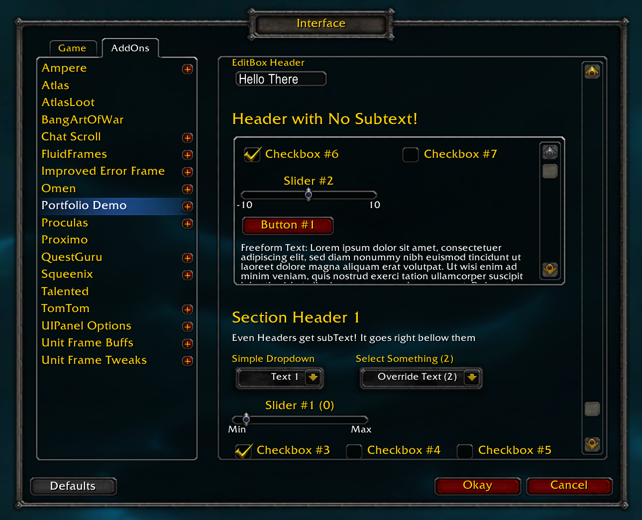
Implemented Option Types
- Header - CONTROLTYPE_HEADER
- Text - CONTROLTYPE_TEXT
- Checkbox - CONTROLTYPE_CHECKBOX
- Slider - CONTROLTYPE_SLIDER
- Button - CONTROLTYPE_BUTTON
- DropDown - CONTROLTYPE_DROPDOWN
- ColorPicker - CONTROLTYPE_COLORPICKER
- EditBox - CONTROLTYPE_EDITBOX
- Window - CONTROLTYPE_WINDOW
Option Attributes
Common Option Table Attribute Descriptions
- id - Unique option id. Used to create the names of the option frames (No Spaces!). Key used to store the value in the saved variables table if cvar/uvar/tvar are nil.
- type - Type Variable. ex: CONTROLTYPE_HEADER
- text - Option text. String (with optional format string like %s or %.2f to insert value), function(control, key) returning a string, or both.
- tooltipText - (Optional) Text used in hover tooltip. String, String with %s for value, or function(value) returning a String
- init - (Optional) function(control) called after the option is created, for customization.
- defaultValue - Default value for options
- callback - (Optional) function(color, isGUI, isUpdate) called when the value is changed
Note: isUpdate is true when control:Update() is called, when the callbacks are initialized after variables load. - cvar - (Optional) CVar, SetCVar(cvar, value)
- event - (Optional) SetCVar argument, SetCVar(cvar, value, event), requires cvar
- uvar - (Optional) Global Variable Name, setglobal(uvar, value)
- tvar - (Optional) Table Variable Key, for optionsFrameRef.savedVarTable[self.tvar] = value or varTable[tvar] = value
- varTable - (Optional) Custom Variable Table, requires tvar
Header
- id
- type - CONTROLTYPE_HEADER
- text
- subText - (Optional) Subheader Text
- init
Text
- id
- type - CONTROLTYPE_TEXT
- text
- init
Checkbox
- id
- type - CONTROLTYPE_CHECKBOX
- text - Text shown to the right of the checkbox
- tooltipText
- init
- defaultValue - "0" or "1"
- invert - (Optional) inverts the value of the checkbox, "1" means unchecked, "0" means checked
- callback
- dependentControls - (Optional) Table of frames to disable when this one is set to "0"
- dependentOptions - (Optional) Table of id's of other options to disable when this one is set to "0"
- cvar
- event
- uvar
- tvar
- varTable
Slider
- id
- type - CONTROLTYPE_SLIDER
- text - Text shown above the slider
- tooltipText
- init
- minText - (Optional) Text used under the left arrow
- maxText - (Optional) Text used under the right arrow
- minValue - Number (Used for minText if minText = nil)
- maxValue - Number (Used for maxText if maxText = nil)
- valueStep - Number, slider granularity, divides evenly into maxValue - minValue
- defaultValue - Number, between minValue and maxValue
- callback
- cvar
- event
- uvar
- tvar
- varTable
Button
- id
- type - CONTROLTYPE_BUTTON
- text - Text shown on the button
- tooltipText
- init
- callback
Dropdown
- id
- type - CONTROLTYPE_DROPDOWN
- text - (Optional) Text shown on the button
- headerText - (Optional) Text shown above the button
- tooltipText
- defaultValue
- menuList - List of buttons
- width - (Optional) static width of the control
- minWidth - (Optional) min width of the control, larger text will resize the contol. Default 100.
- nochecks - (Optional) Boolean, don't initialize empty menuItem.checked
- nofuncs - (Optional) Boolean, don't initialize empty menuItem.func
- init
- callback
- cvar
- event
- uvar
- tvar
- varTable
ColorPicker
- id
- type - CONTROLTYPE_COLORPICKER
- text - Text shown to the right of the color swatch
- tooltipText
- init
- defaultValue - color table {r=#, g=#, b=#, opacity=#} (opacity is optional)
- callback
- hasOpacity - (Optional) boolean to show opacity slider
- cancelFunc - (Optional) function to call when the color change is canceled, after it's reset to the previous color
- cvar
- event
- uvar
- tvar
- varTable
EditBox
- id
- type - CONTROLTYPE_EDITBOX
- headerText - (Optional) Text shown above the button
- tooltipText
- init
- defaultValue
- callback
- cvar
- event
- uvar
- tvar
- varTable
Window
- id
- type - CONTROLTYPE_WINDOW
- init
- options - List of option tables
- width - (Optional) Number, defaults to calculated based on parent width
- height - (Optional) Number, defaults to 200
Notes on Dropdowns
This implementation of dropdowns is about half way between managed and unmanaged. It has some shortcuts, but is essentially blizzard's dropdown code at its core. Because of this it is very powerful and can be customized by advanced users to do almost anything. But for those of you new to dropdowns you don't have to be intimidated, because I've done all the setup for you. The minimum you have to supply is a table formatted list of buttons. Each button should have a text, and a value. The checks and callback will be managed if left empty.
For advanced users the func and checked attributes can be overriden. You can also use any of the normal dropdown attributes. See FrameXML/UIDropDownMenu.lua for a full list of menu item attributes. And as will all controls you can override any of the settings or methods using the init function if you need something more customized.
I've also simplified the dropdown button itself, using UIDropDownMenuTemplate as a template on top of which I've added shortcuts and modifications. Texture anchors have been modified to play nicely with control:SetWidth(x) so that you don't have to use UIDropDownMenu_SetWidth. The clickable/tooltip area has also been extended to cover the whole button.
Saved Variables
Portfolio uses LibDefaults to manage your defaults for you if you wish. The normal way to handle defaults is to put the name of your saved variable table in optionSetTable.savedVarTable, but you can also supply individual options with their own varTable. Then you can supply a tvar to be the index to that saved variable table, otherwise the id will be used as the index. Alternately you can supply an option with a cvar or uvar (global variable name) to use instead. Note that if you supply none of the above Portfolio simply won't handle your variables. You can then manually update the options using the callbacks and init functions. You can also supply optionSetTable.initCallbacks = false in order to disable callbacks being fired when after the variables load.
Since Portfolio has no saved variables of its own and allows you to be flexible with your saved variable structure you can easily use the same saved variables with or without Portfolio. Your Portfolio GUI options can be truly optional. I'd suggest using LibDefaults to save live memory and avoid saving/loading in default values, but you don't have to.
Registration
Embedding
See PortfolioDocs for more information.
Examples
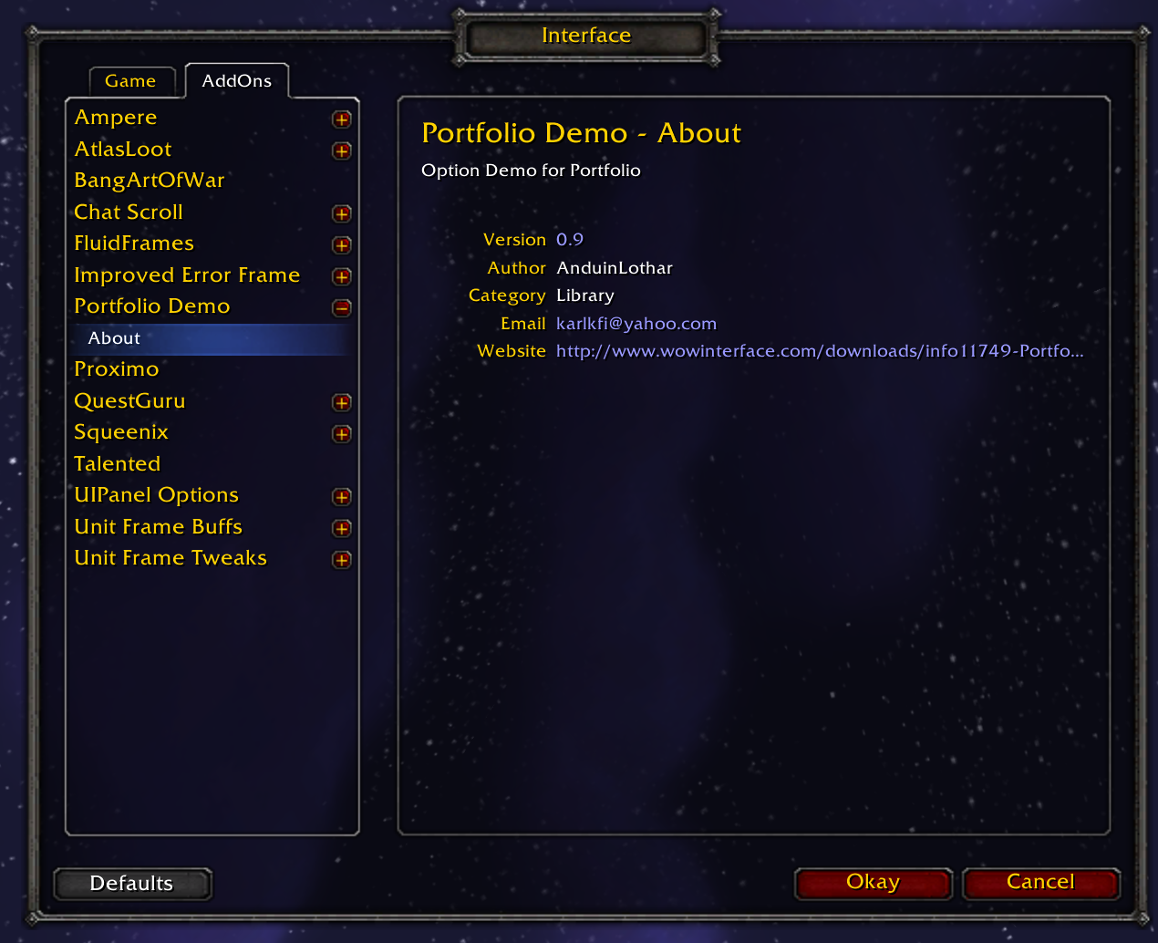
The PortfolioDemo addon is included in this package. It is disabled by default so it won't bother users, but it should be an invaluable resource to those of you who learn by example. It should have a variety of usages for each implemented option type.
- Added static 'width' option for Dropwdown controls
v1.22
-Fixed a bug where disabling the about panel also disabled initial loading callbacks
v1.21
- Fixed text value insertion
- toc bump to 30100
v1.2
- Fixed bug with empty Windows
- Added more robust text value insertion, handling %.2f for example
- Added optionSetTable.about = false to opt out of the about panel
- Added ChangeLog.txt
v1.1
- Added CONTROLTYPE_WINDOW for child frame control windows (optionally scrollable)
- Modified Scrollbars to be inside the window, have a border, and still be scrollable while moused over
Window width is now modified depending on the visibility of the scrollbar.
- Renamed UpdateTextWrap to UpdateBox and it is now called on child controls when the window scroll box is changed
- Fixed an error with dropdown entry selection
- Modified SetRelativePoint for better extensibility:
Added xOffset and yOffset fields for modifying the default offset from the anchor control.
Added xOffsetRelative and yOffsetRelative fields for modifying the default offset of relatively anchored controls.
xOffset and xOffsetRelative are also used in calculating the default width for windows.
v1.0
- Added CONTROLTYPE_EDITBOX
- Removed isTemp and replaced it with isGUI which is only a passthrough value to the callback; text and saved var are still updated.
It is now: callback(value, isGUI, isUpdate)
isGUI is now passed as true for all GUI control interactions (but not for the Okay, Cancel and Default blizzard option panel buttons).
- Added control:Refresh() called when the blizzard options frame is shown
- Added control:Okay(), control:Cancel() and control:Reset() that are called for each control that has them when you click the blizzard interface buttons
- Fixed Cancel to correctly revert values/controls to their previous state. Doesn't pass isGUI.
v0.94
- Added CONTROLTYPE_COLORPICKER
- Added Portfolio.Round
v0.93
- Refactored some code/files
- Added PortfolioDocs (Using a custom LuaDoc format)
- Renamed checkbox.dependentOptions to dependentControlsByID for clarity
v0.92
- option:Enabled() now restores custom font object colors
- Fixed success and result global var leaks
- Added CONTROLTYPE_DROPDOWN
- Added control click sounds
- Fixed tooltipText to be optional
v0.91
- Fixed a bug with text functions
v0.9
- Added CONTROLTYPE_TEXT
- TODO: Fix Text height/wrapping
- Added control:Reset() - Disable() no longer resets.
- dependentOptions will reset after disabling, but dependentControls will not
- UpdateDependentControls renamed UpdateDependents, handles both dependentOptions and dependentControls
- slider:SetMinMaxValues(min, max) now updates the stored min/max and texts if minText/maxText are not set
- Enable/Disable now changes text color
- tooltipText is now as flexible as text
- Headers and Text controls now dynamically resize with text:UpdateTextWrap() called OnShow
- Refactored and abstracted much of the control functionality to Portfolio.Control and renamed files.
- Fixed a bunch of minor bugs
v0.8
- Text can now have %s or %d to be formatted with the option value. control:UpdateText() is called when an option is updated
- Added dependentControls and dependentOptions for CONTROLTYPE_CHECKBOX to Enable/Disable other options
- control:Disable() now resets the value to default
- Cleaned up OnShow code so it doesn't call callbacks excessively
- callback(value, isUpdate) now pass an extra boolean argument when called by control:Update() (used when loading vars)
v0.7
- Working Slider option
v0.6
- Now uses LibStub to handle library versioning
- Removed event handling code and default variable initialization in favor of using LibDefaults
- Upgraded to InterfaceOptionAboutPanel lib
- Removed noAutoDefault. Now always loads vars that have defaults set.
- loadVars is renamed initCallbacks and now defaults to true
- Changed how GetValue/SetValue/Update works on the options
v0.5
- Added control:init() function for custom modification to the config frame
- Added callbacks on vars loaded (or before init if LoD) if loadVars is set
- Added Button
- Added some Dropdown code (incomplete)
- Added AboutPanel generated from toc info
v0.4
- Refactored the code into 3 files
- Added some Slider code (incomplete)
- Changed the registration arguments to match blizzard's format
v0.3
- Only loads once if embedded
- Defaults are now defined on vars loaded (immediately if registered after) if a default is supplied and the saved variables are nil
- Added noAutoDefault param for options and option sets. If defined, option's value overrides set's values.
v0.2
- Added a scroll frame for the main option panel
- Slider in progress
- Code cleanup
v0.1
- Checkboxes work
 |
Comment Options |
 12-08-08, 12:32 PM
|
||
|
Nobody of Importance
 Forum posts: 95
File comments: 208
Uploads: 23
|
I guess the main competitor is AceGUI-3.0. It has option grouping, icons and keybinding controls that Portfolio doesn't have, but I may consider adding them if someone actually wants to use them. Grouping can actually be done currently with the 'point' system I've built in, it just wont have a background or a way to toggle through a bunch of hidden options, unless you add that up yourself (which wouldn't be too hard). You could easily use a set of buttons as tabs, clicking them to show a certain set of options. You could even change the texture of the buttons to look like tabs and add a background/border frame. Anyway, I'll evaluate new features once I get the todo list done.
Last edited by AnduinLothar : 12-08-08 at 12:33 PM.
|
|

|

|
| AnduinLothar |
| View Public Profile |
| Send a private message to AnduinLothar |
| Visit AnduinLothar's homepage! |
| Find More Posts by AnduinLothar |
| Add AnduinLothar to Your Buddy List |
|
12-08-08, 10:27 AM
|
|
|
An Aku'mai Servant
Forum posts: 34
File comments: 32
Uploads: 3
|
I'm excited to try it, but can you briefly list the major differences between this and other options table managers? Why should I use Portfolio instead of its alternatives?
|
|
|
|
| Eidolarr |
| View Public Profile |
| Send a private message to Eidolarr |
| Visit Eidolarr's homepage! |
| Find More Posts by Eidolarr |
| Add Eidolarr to Your Buddy List |
|
11-29-08, 12:15 PM
|
|
|
Mmm... cookies!!!
Forum posts: 772
File comments: 313
Uploads: 5
|
Thanks man!

__________________
Never be satisfied with satisfactory. |
|
|
|
| Cralor |
| View Public Profile |
| Send a private message to Cralor |
| Visit Cralor's homepage! |
| Find More Posts by Cralor |
| Add Cralor to Your Buddy List |
|
11-28-08, 08:31 PM
|
|
|
A Defias Bandit
 Forum posts: 2
File comments: 47
Uploads: 1
|
very nice work, actualy just what i needed! still waiting for dropdown support ^^
|
|
|
|
| Silentspy |
| View Public Profile |
| Send a private message to Silentspy |
| Visit Silentspy's homepage! |
| Find More Posts by Silentspy |
| Add Silentspy to Your Buddy List |
|
11-24-08, 12:37 PM
|
|
|
An Aku'mai Servant
Forum posts: 30
File comments: 38
Uploads: 6
|
This is a great tool, thanks Karl. Keep up the great work
 |
|
|
|
| Gryphon |
| View Public Profile |
| Send a private message to Gryphon |
| Visit Gryphon's homepage! |
| Find More Posts by Gryphon |
| Add Gryphon to Your Buddy List |
|
Support AddOn Development!
You have just downloaded by the author . If you like this AddOn why not consider supporting the author? This author has set up a donation account. Donations ensure that authors can continue to develop useful tools for everyone.
*Clicking the donate button above will take you to PayPal.com
*Clicking the donate button above will take you to Pledgie.com